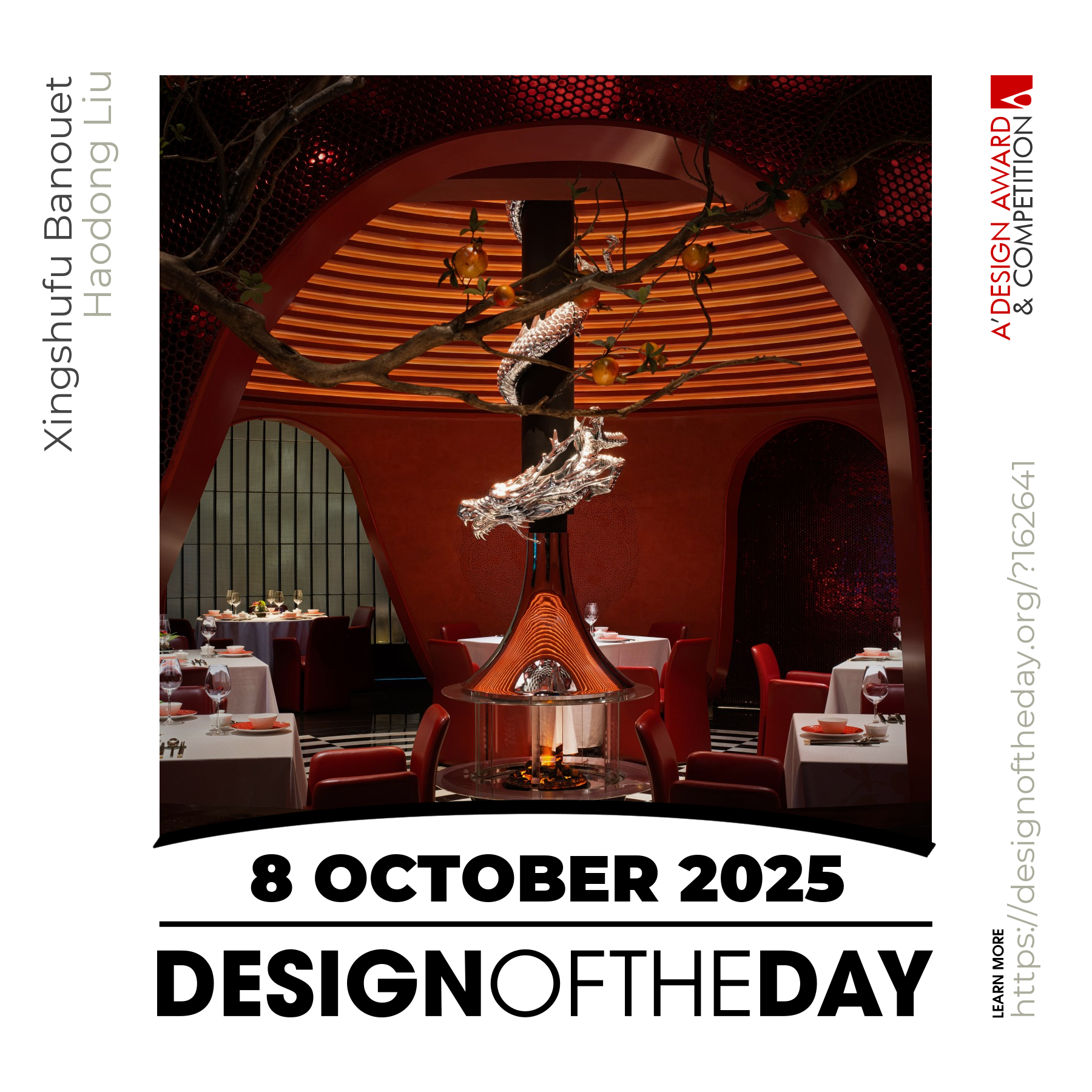
Interview about Hocking Hills Web Design, winner of the A' Interface, Interaction and User Experience Design Award 2025
The redesign of Hockinghills.com introduces a streamlined and contemporary booking platform for nature stays and outdoor activities. Prioritizing clarity and usability, the updated design features a minimalist approach that highlights the natural beauty of Hocking Hills. A refined user interface, optimized navigation, and a set of over 100 custom icons enhance accessibility and functionality. The result is a cohesive and engaging digital experience that simplifies trip planning while staying true to the brands dedication to nature, community, and seamless exploration.
View detailed images, specifications, and award details on A' Design Award & Competition website.
View Design DetailsThe key was to never let the technology overpower the story of Hocking Hills. From the beginning, our goal was to make the platform feel like a quiet companion to nature, not an intrusive digital layer. We streamlined booking flows and navigation to be as intuitive as possible, but visually, we leaned on restraint. Neutral, earthy tones, subtle textures, and plenty of breathing space ensure the experience feels calm, inviting, and reflective of the park's organic beauty, rather than corporate or over-designed. It was a constant balancing act between functionality and feeling.
The icon set was designed to quietly guide, not distract. Our philosophy was rooted in simplicity and clarity, with visual language inspired by natural forms: rounded edges, soft curves, a sense of approachability. Every icon serves a specific purpose, distilled to its essence so users recognize it intuitively. We also maintained consistent line weights and style to avoid visual noise. By keeping the system coherent, the icons help declutter information and improve scalability without adding complexity.
Even though I was working from France and the project was rooted in Ohio, the love for nature is a universal feeling. That was our foundation. We didn’t approach this as just a local tourism platform, it was about capturing that shared human connection to being outdoors, exploring, and finding peace in nature. The visual language, the calm tone, the intuitive structure, all of it was designed to feel welcoming whether you’re a local planning a weekend getaway or an international visitor discovering Hocking Hills for the first time. Nature brings people together, and we built on that idea.
For me, minimalism isn’t about removing for the sake of aesthetics, it’s about focusing attention. We started by asking what truly adds value to the user's journey. Visual clutter, heavy gradients, or complex graphics were stripped away. We retained subtle textures, understated photography, and a harmonious color palette: elements that complement the park's natural character. Anything that didn't serve clarity, mood, or usability was eliminated. The result feels intentional, calm, and human.
The previous website had been in place for almost 15 years, and while it served its purpose for a time, both the navigation flow and the overall UI were no longer relevant to today’s user expectations. We wanted to modernize the look and feel, but design isn’t just about aesthetics, it’s about solving real problems. That’s where the user data became essential. We studied how people interacted with the old platform and identified points of confusion, like several pages offering overlapping functions, which we streamlined or eliminated entirely. We also improved the overall flow to make it more intuitive, reducing friction and helping users find what they need with ease.
We approached the design system like building with adaptable, well-crafted pieces. Typography, color palette, spacing rules, and iconography were defined early with enough flexibility to evolve as new requirements emerged. The key was establishing clear visual principles - natural, approachable, minimal -so even as components grew, the system stayed coherent. Regular design reviews ensured alignment, and because the foundation was solid, scaling the system didn’t dilute the brand character.
The biggest challenge was ensuring the immersive, spacious feel translated to smaller screens without sacrificing usability. Mobile users often book on the go, so we prioritized thumb-friendly interactions, simplified navigation, and collapsible menus. We also adjusted spacing and imagery to maintain a sense of calm, not overwhelm. Testing across devices was constant, our goal was that whether on a desktop or phone, users experience the same intuitive, nature-inspired flow.
It was never about imposing a trendy design language. We focused on quiet modernity - clean lines, thoughtful typography, and restrained color choices that feel contemporary but never sterile. Local heritage was honored through organic textures, earthy tones, and respectful imagery that highlight the park’s beauty without resorting to clichés. The result feels both modern and grounded, acknowledging where the brand comes from while preparing it for where it's going.
I believe digital experiences for nature-focused destinations should evoke the same values as the places themselves: calm, clarity, and connection. With Hocking Hills, we demonstrated that platforms can be efficient and modern without losing authenticity. I hope this encourages other brands to move away from over-commercialized, template-driven solutions and instead create digital spaces that respect the environment they represent, inviting exploration while staying true to the essence of the place.
Booking a cabin or planning activities shouldn’t feel like filling out a tax form. We broke the process into digestible steps with clear progress indicators. Visual hierarchy guides users intuitively, while contextual information - like availability tips or map previews - appears only when needed. We reduced form fields, optimized search filters, and ensured actions like reserving, paying, or exploring activities feel light and seamless. The platform offers everything users need, just without the overwhelm.
Dive into a world of design excellence with our curated highlights. Each feature showcases outstanding creativity, innovation, and impact from the design world. Discover inspiration and learn more about these incredible achievements.